In today’s dynamic and data-driven landscape, the ability to transform raw information into meaningful insights is paramount for informed decision-making. One powerful tool that has been gaining prominence in the realm of data analytics is Microsoft’s Power BI. In this blog post, we’ll explore the realm of data visualization using Power BI, a powerful data analytics tool, with insights gained from the teachings of my course mate.
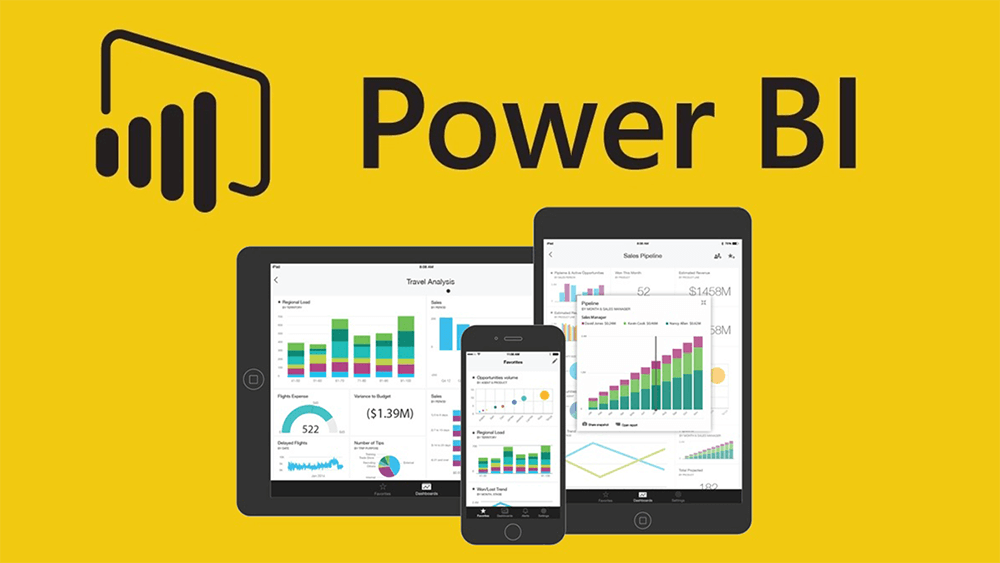
Power BI, developed by Microsoft, stands out as a robust business analytics tool, empowering users to visualize and share insights seamlessly across organizations or embed them in applications and websites. Its user-friendly interface, coupled with advanced features, positions it as a preferred choice for professionals and data enthusiasts alike.
During our class last week Saturday, my course mate Chidozie Nwalibe led the class in a sample practical on how to use this tool for effective data visualization.
Here are a few things which I learned:
It provided invaluable insights into the effective use of Power BI for data visualization. One of the fundamental lessons emphasized was the significance of data preparation. Before venturing into visualization, ensuring that data is clean, transformed, and in the right format is foundational for accurate and meaningful insights. Power BI facilitates this process by allowing users to connect to diverse data sources, ensuring a solid foundation for analysis.
Regarding Visualization, Power BI also offers a wide array of visualization tools, from basic charts to intricate dashboards. We were shown how to choose the different visualization charts for specific datasets, enhancing the clarity and impact of the message being conveyed.
All these were quite new and somewhat exciting to me. Dare I say this was most likely the first data analytics class I understood since the semester started. Because of how intriguing I found the class, I went a step further in research and realized a few more things such as Interactivity and Filters. Interactivity is a key feature of effective data visualization. I was able to find out how to use filters and slicers in Power BI to allow users to interact with the data dynamically, gaining deeper insights and customizing their viewing experience.
Also, a well-designed dashboard design is essential for conveying information concisely. I was able to go through the principles of dashboard design, including the use of colour, layout, and storytelling techniques to engage the audience effectively.
Finally, Sharing and Collaboration in Power BI facilitates easy sharing and collaboration. I had read on the process of sharing reports and dashboards securely, enabling team members to collaborate in real-time and make data-driven decisions collectively.
In conclusion, I was able to learn that Power BI is not just a tool, but a gateway to unlocking the true potential of data. Therefore, understanding the basics of Power BI and its application in data visualization allows individuals like myself and organizations to harness the power of data for informed decision-making. This is definitely one skill which I strongly believe will help me on my journey during this MBA program and I hope for more understanding classes like this.
#MMBA5